THE ELEMENTS OF ART - PART ONE
THE ELEMENTS OF ART PART ONE
LINE can be used by artists to draw a sketch that is vertical, horizontal, crosshatch, diagonal, dotted or broken, wavy or zig zag. A line can be thick or thin. By combining different lines one can begin to show textures, shapes or forms. A thicker line in the foreground would imply being close then a thinner line in the background.
SHAPE / FORM can be either GEOMETRIC or ORGANIC Shape is two dimensional (height and width) where as form is three dimensional (height, width and depth). Shapes are usually drawn or painted on paper or canvas. Artwork expressed as a form is usually more sculptural.
COLOUR is mentioned throughout my entire website. The Theory of Colour is credited to Sir Isaac Newton.
He is the first to realize that the colour spectrum we see is made up of light. You can read about his colour spectrum theories and the colour wheel in his (PDF) 1704 book Optiks. I was introduced to the study of colour when I studied at Pratt Institute, New York in 1974-75. I studied the Bauhaus Colour Theories of Johannes Itten and Josef Albers.
This Video explains simple colour theory .
The different classifications for colour are ADDITIVE AND SUBTRACTIVE. For ADDITIVE colours we ADD or MIX the colours. This is found in: computers and TV. By ADDING Red, Green, Blue lights we are able to see the colour spectrum. Red and Green combined will give you a Yellow light colour. Green and Blue combined will give you the colour Cyan. Red and Blue will give you the secondary Magenta colour. Together Green,Blue and Red will give visualize a White (light) colour.
The SUBTRACTIVE COLOURS called CMYK = Cyan, Magenta, Yellow and blacK colour are used in the printing and packaging industries. You can always see the square CMYK colour registers on any Package. My Mondragam “Quaker Apple Cinnamon”” is an example of CMYK. ( Of course …. without the spoon).
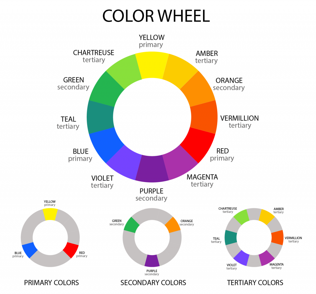
The SUBTRACTIVE COLOURS Yellow, Blue and Red are paint colours used by artists. This is commonly called “The Colour Wheel”. By studying The Wheel artists are able to select the Colour’s Hue, Shade, Tint and Tone. We view colours by looking at the : Hue, Value and Intensity.
HUE refers to the colour and its placement on the colour wheel. For example is it a “yellow, red, or blue hue?” Then is it more orange. Perhaps the colour is more yellow-orange OR orange-red?
VALUE is used by artists to make it lighter or darker. It includes the SHADE or TINT of a colour. Shades of a colour are created by adding black. Shades are darker and tints are lighter. A tint is created by adding more white.
INTENSITY refers to how BRIGHT (SHINY) or DULL (MAT) a colour is. It means that a colour is saturated or not saturated. For example is the mixture of a yellow orange colour more yellow or more orange to our vision. The purity of a colour is called chroma .
TINTS >>>>>>>>>>>>>>>>>>>>>>>>>>>>>>>>>>>>>><<<<<<<<<<<<<<<<<<<<<<<<<<<<<<<<<<<<<<<<SHADES
SPACE includes the object that we see and also the area around the object. When viewing artwork it is important to see the POSITIVE and NEGATIVE SPACE. We need to “SEE” both when looking at a painting, photograph or sculpture, something acthitecural. The “SPACE” around the art or design gives us the fore, middle and backgrounds. It allows us to view the 2D or 3D image or form. There is also what is called “White Space”. Creating the illusion of 2D Space in art occurs with: linear, overlapping, placement of a large to smaller shape. Please watch this SPACE video.
SPACE : What do you see? A vase or two faces in profile looking at each other? Are you a “Positive Art Person” or a “Negative Art Person” ?
TEXTURE adjectives describe the feel of a 2D or 3D art surface. There are two types of texture: Actual and Implied. It tells us that a surface is: “bumpy, hard, grainy, rough, shiny, smooth, soft, polished. Does it look like: concrete, fur, glass, glittery, metal, rocky, woody. Is it hard or soft. When teaching I would ask my art students to create a pencil drawing of a spoon in a glass of water. Afterwards they would be asked to paint a watercolour painting.
PERSPECTIVE Here is a video that explains Perspective Theory. This is perhaps one the most difficult theories for visual art students to grasp. It is really about training your eye to see that objects that are closer are more detailed and larger compared with objects in the middle or background. Most students always had trouble drawing roofs, sidewalks and telephone poles (or trees). When teaching perspective I would first start off asking my students to draw a room in their home using one point. Afterwards, I would ask my art students to draw the room again using two point perspective. Instead of a shape students also learn perspective when creating a landscape drawing or painting. The colours in the foreground should be a lighter tint than the shaded colours in the background.
When it comes to the study of Perspective I would always bring in my art book on M C Escher. His perspective drawings always fascinated my art students. Here is a video on M C Escher’s Art.